One app that shipped and two concepts that stayed in Figma. I design the way I code: a real grid, real content, and the empty, loading and error states before the happy path.
Grindify, the gym app
Side project · phone-first PWA · live at app.grindify.io
Designed around one situation: standing at a rack between sets, phone in one hand, 60 seconds of rest. Dark UI so it does not light up the gym, one accent colour that only marks what you can tap or what just happened, big numbers, and every frequent action within thumb reach. Swedish first, since that is who uses it. Tech and links on the Projects page.
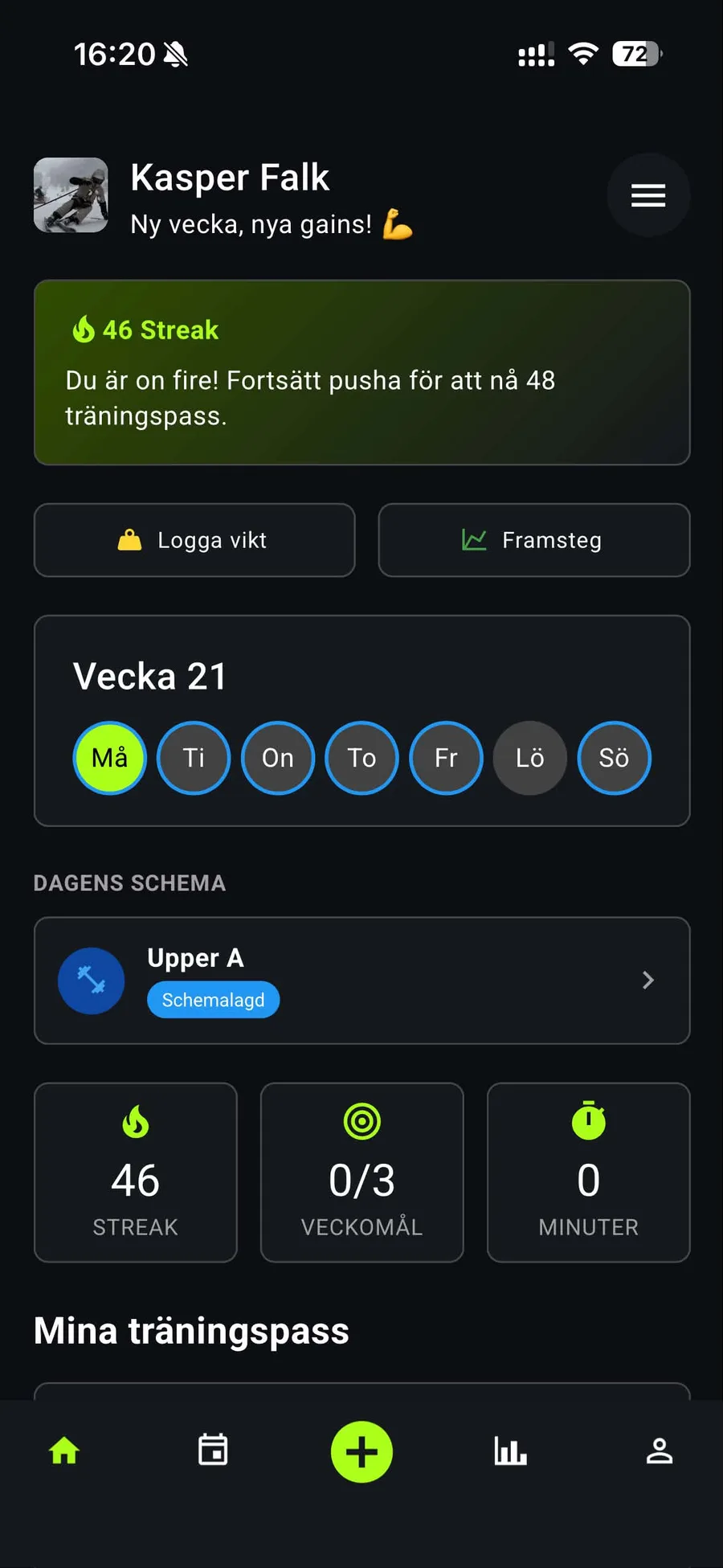
Home. Streak, this week, today's pass. The whole point of opening the app is answered above the fold.
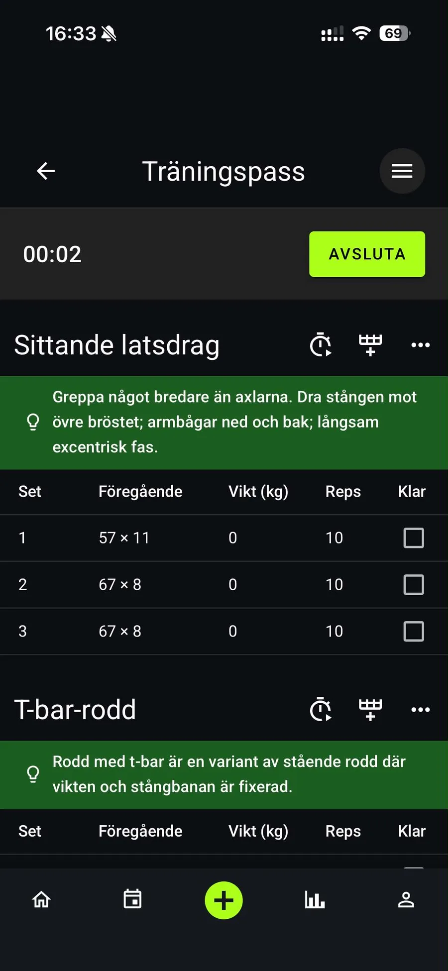
Live session. Last time's weight and reps sit next to the empty fields, so you never have to remember. One checkbox per set.
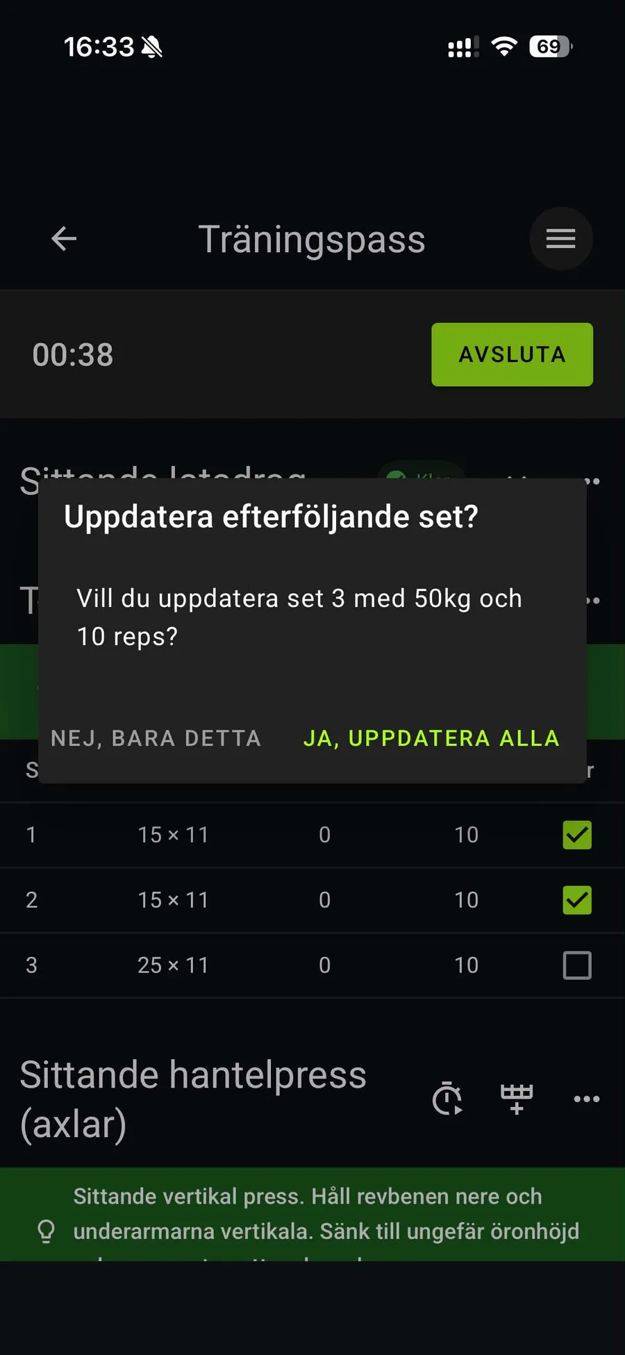
Fewer taps. Change set 1 and the app asks if the rest should follow. The most common case becomes one tap instead of six.
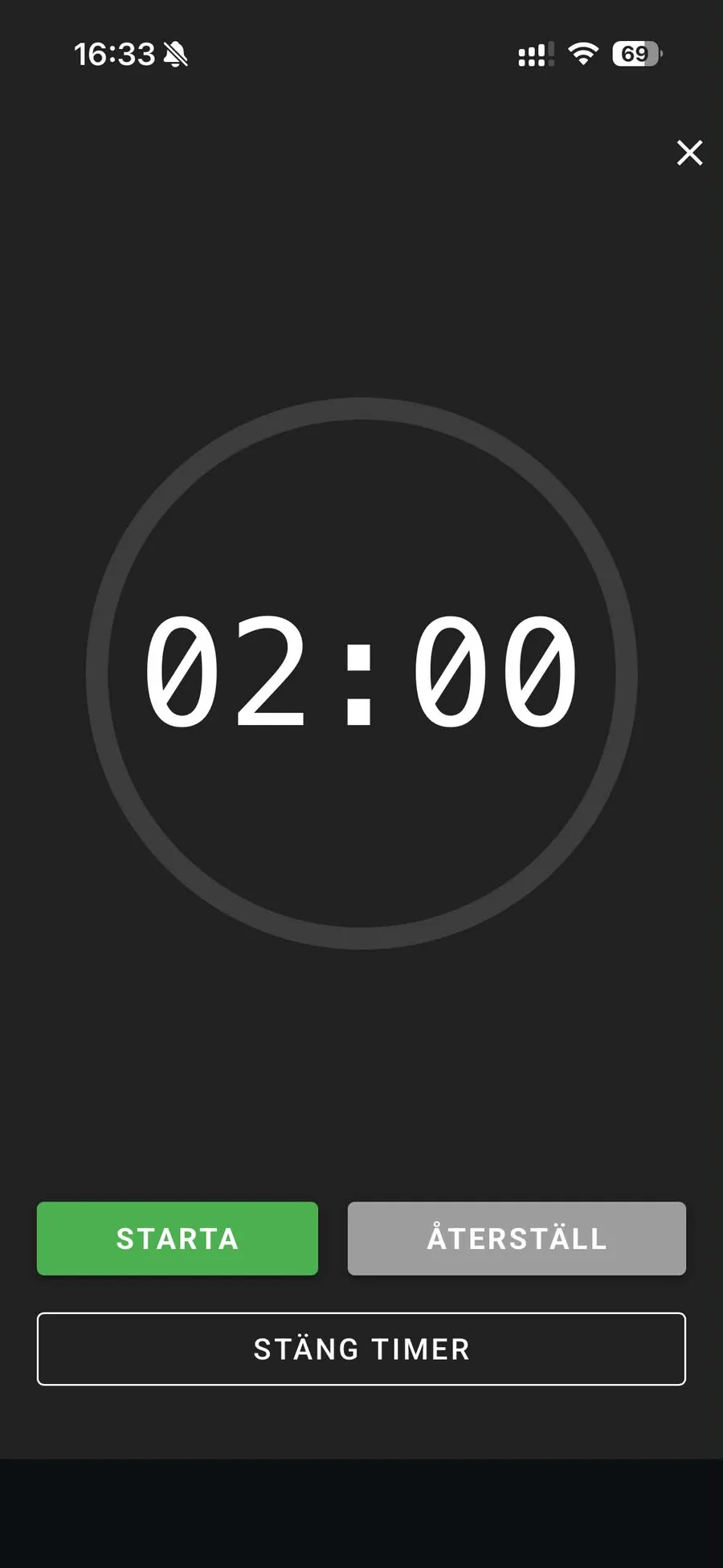
Rest timer. Full screen, huge digits, nothing else. Readable from the floor.
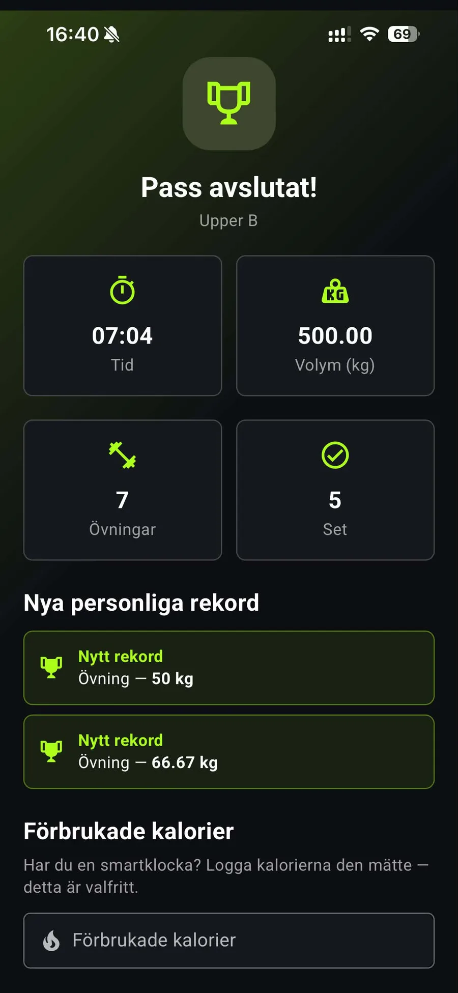
Done. Time, volume, new records. A short moment of payoff before you leave.
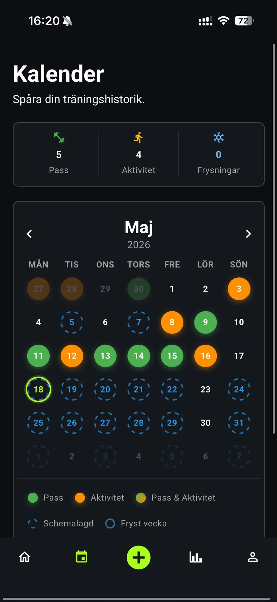
Calendar. Green is a workout, orange an activity, dashed is planned. Streak freezes for weeks off.
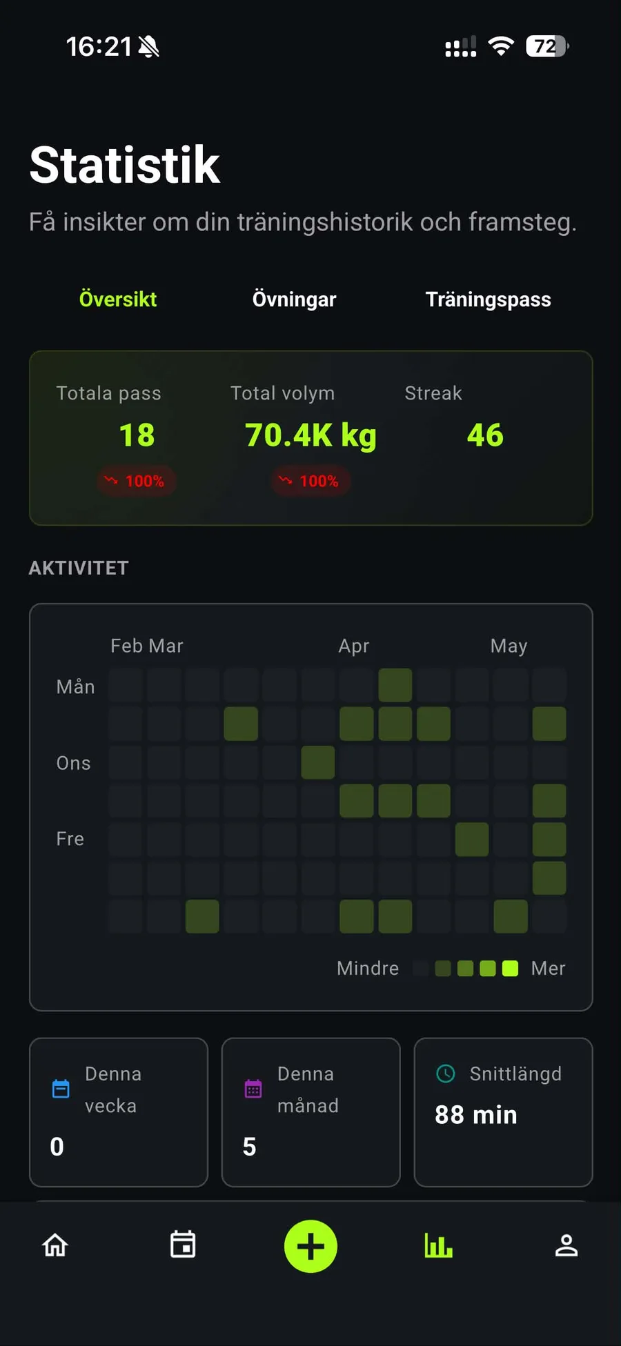
Statistics. Totals plus a contribution-style heatmap. Borrowed from GitHub because it works.
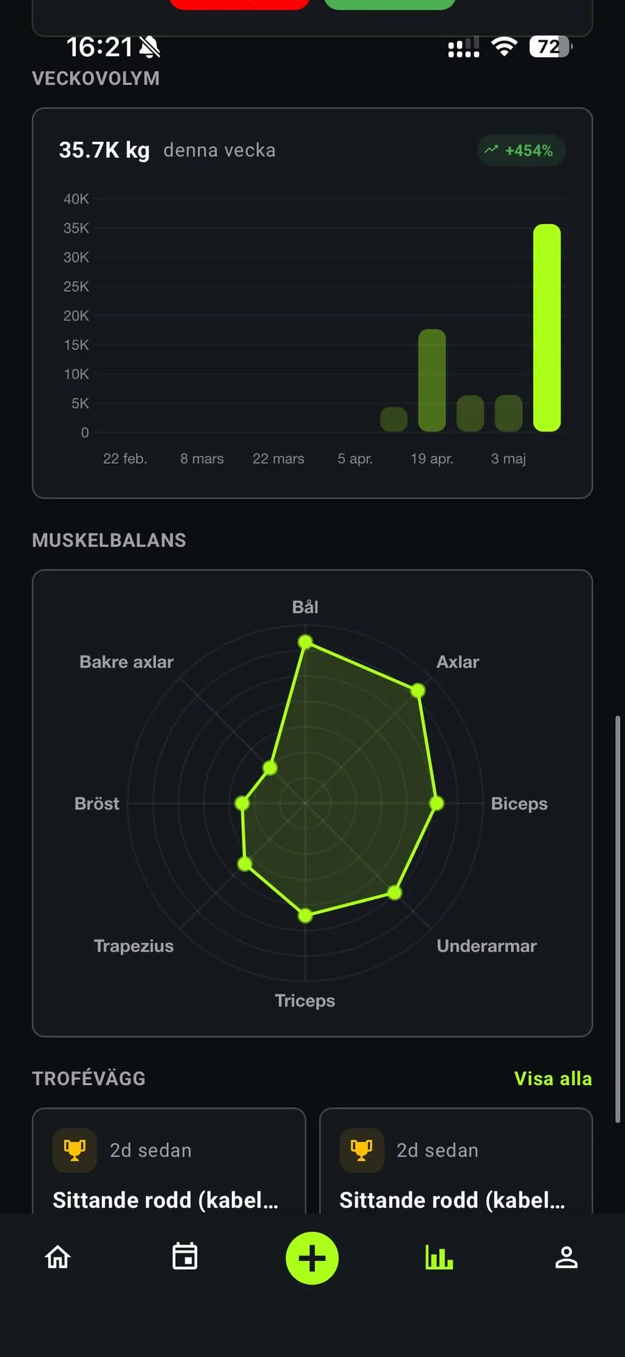
Muscle balance. Weekly volume and a radar of which muscles get the work. Shows what you skip.
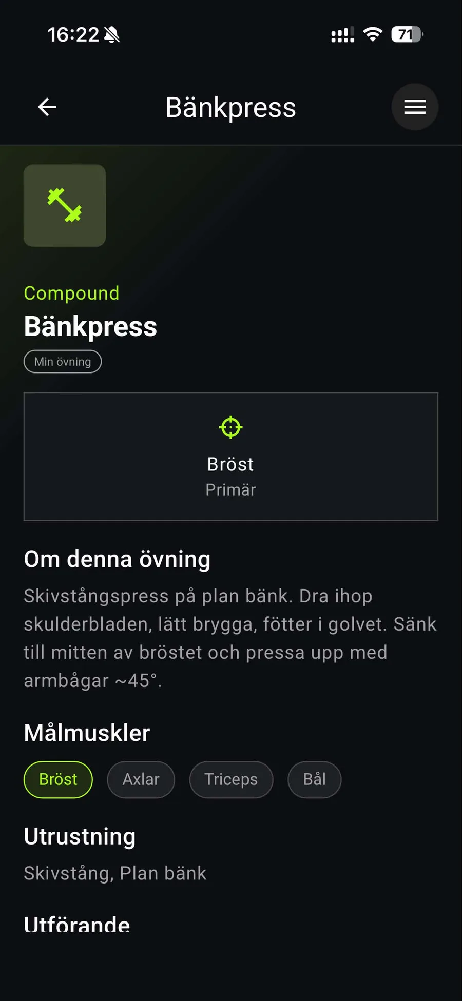
Exercise library. Your own exercises with cues, equipment, pro tips and common mistakes. Shown inline during the session.
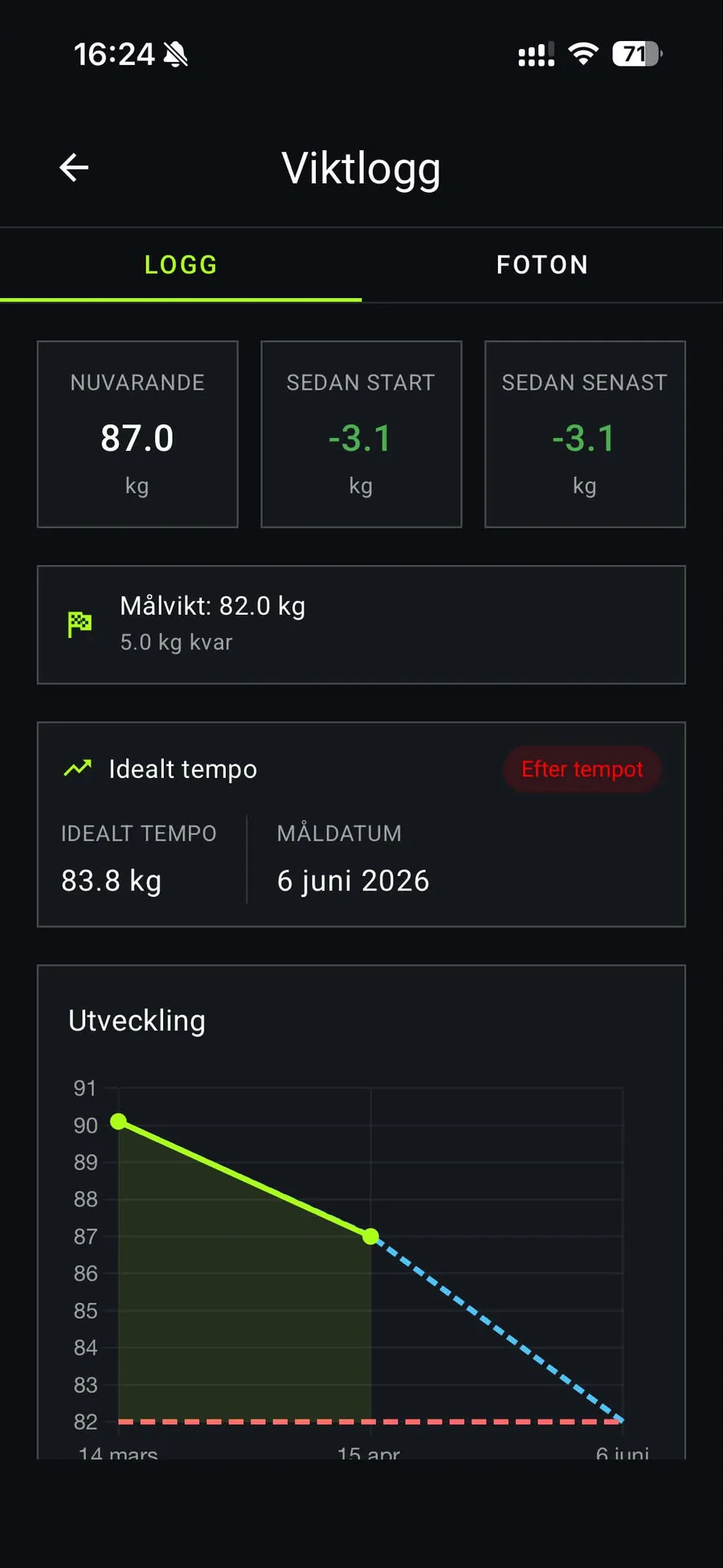
Weight log. Current, since start, goal, and an ideal-pace line so you know if you are ahead or behind.
ParkEstate, parking for landlords
Concept · phone · Figma · not built
An idea for property owners and companies with parking they do not use all day: rent the spots out by the hour through an app. The tenant side is shown here. Map first, since the question is always "where can I park near here", then pick a spot on a floor plan, book a time window, pay, get a QR ticket and a timer you can extend from your seat. Light UI, one blue, rounded cards. Stays a concept; the market is crowded and I chose to spend the time on Grindify.
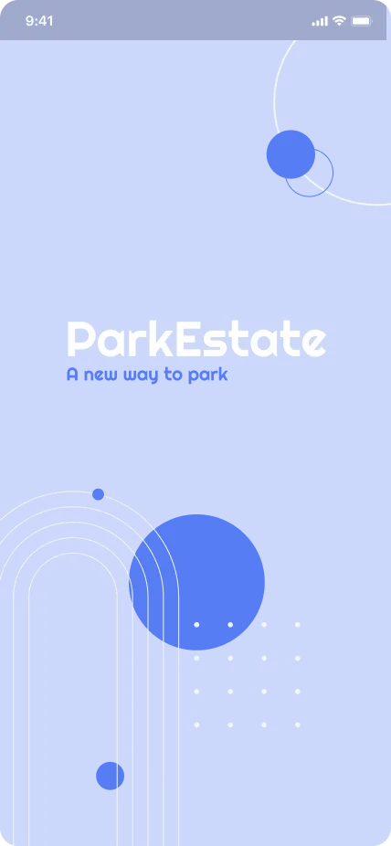
Splash. Wordmark, tagline, geometric shapes. Sets the palette for everything after.
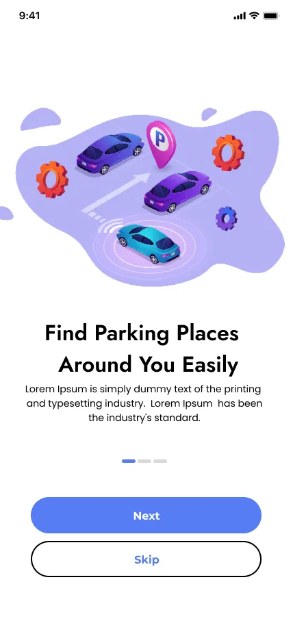
Onboarding. Three screens, three promises: find, book and pay, extend. Skippable.
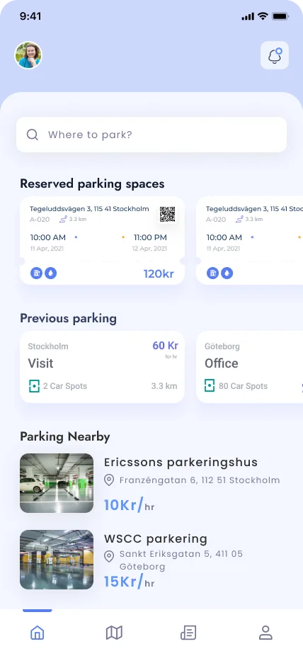
Home. Your active reservation on top, then history and what is nearby. Search bar always reachable.
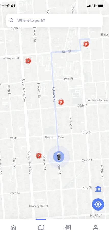
Map. Every available lot as a pin, route drawn to the one you pick. The main way in.
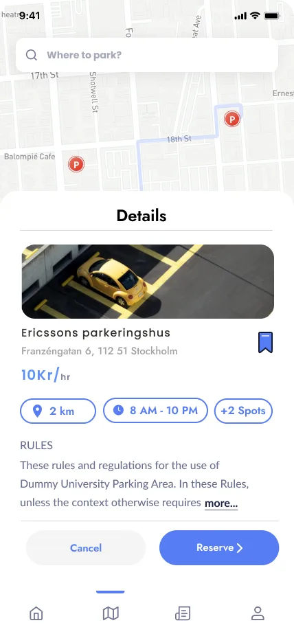
Details. Bottom sheet over the map: photo, price per hour, distance, hours, spots left, rules. Reserve or cancel.
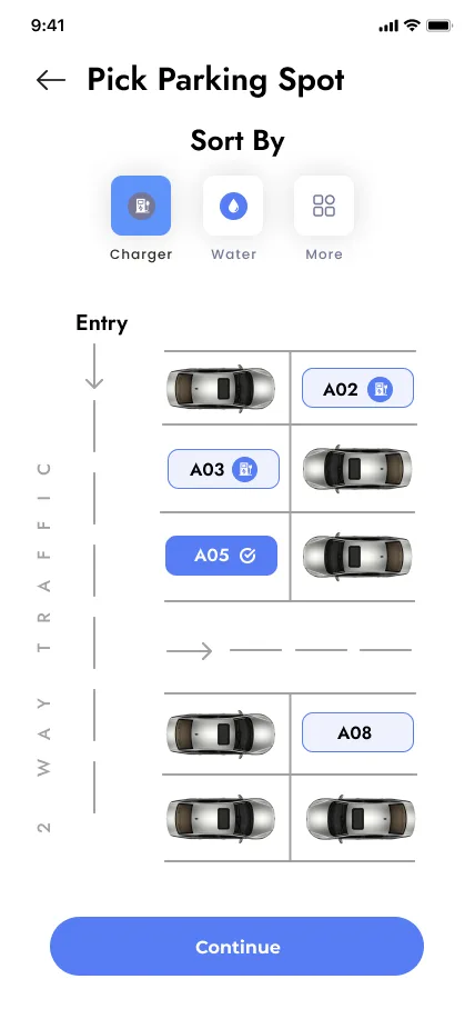
Pick a spot. A floor plan of the garage. Filter by charger or water, tap the bay you want.
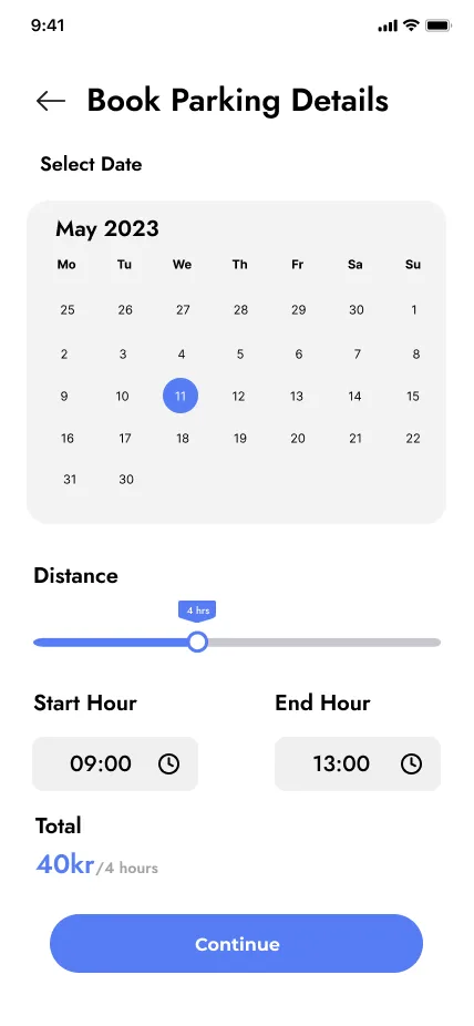
Book. Date, duration, start and end hour, price updates as you drag.
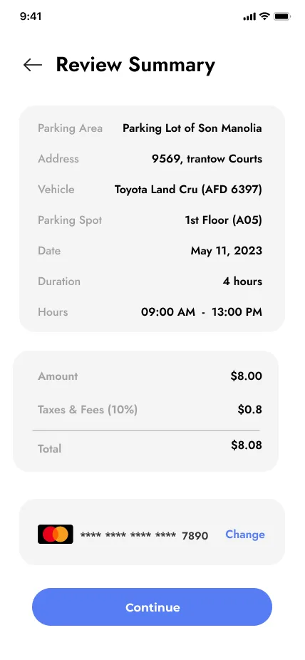
Review. Everything on one card before paying. Change the card without leaving.
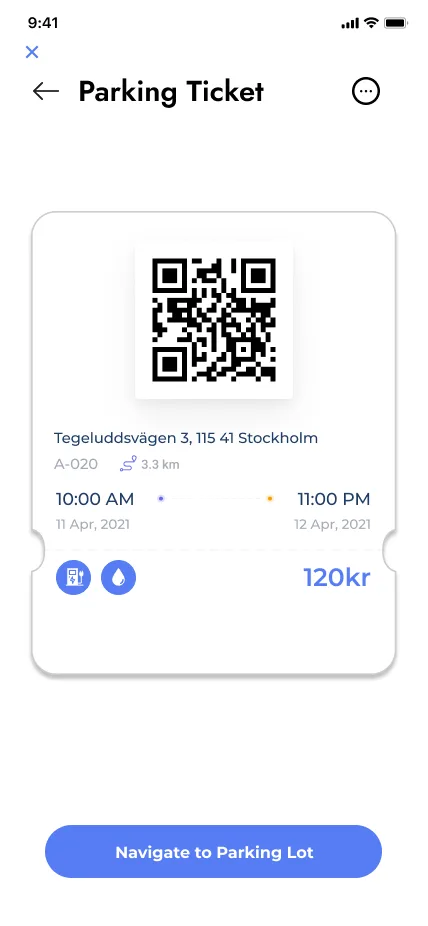
Ticket. QR to open the gate, times, extras, price. Looks like a ticket on purpose.
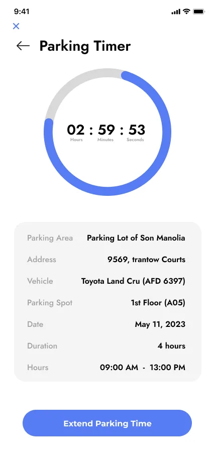
Timer. Time left as a ring, booking details below, one button to extend.
PlatePal, a recipe app
Concept · phone · Figma · not built
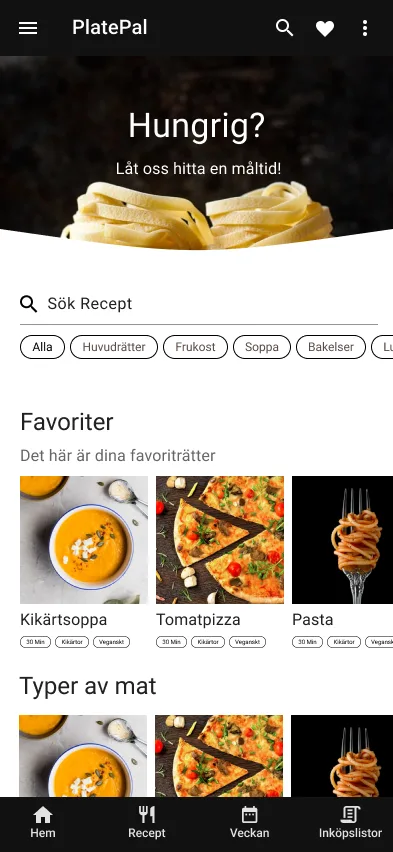
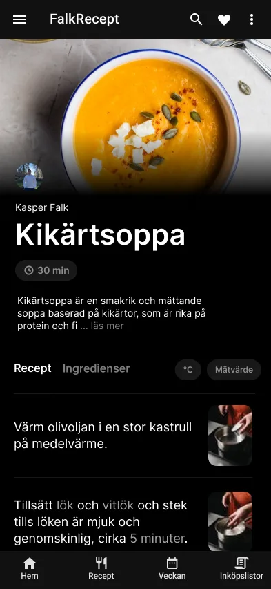
A recipe app for cooking from a phone on the kitchen counter. Dark UI so the photo carries the screen, big step text you can read from a metre away, ingredients highlighted inline in the steps so you do not scroll back and forth. Weekly plan and shopping lists in the tab bar.
Home. Search and categories first, favourites second. The hero photo asks the only question: hungry?
Recipe. Steps with the ingredient and the quantity coloured inside the sentence. Photo per step.
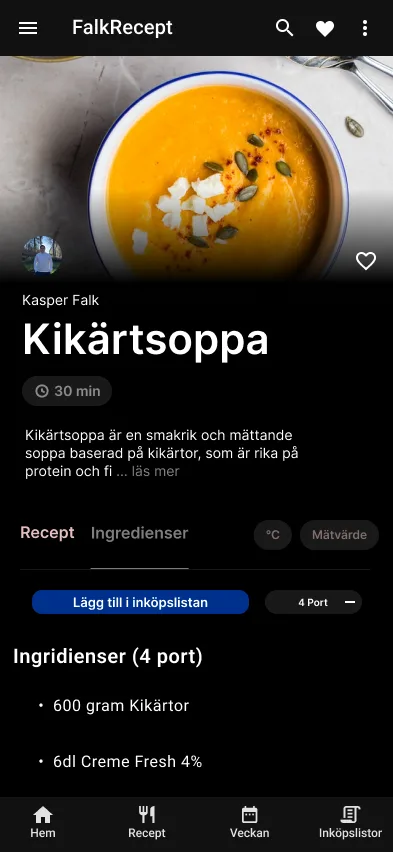
Ingredients. Portion stepper recalculates amounts. One tap adds everything to the shopping list.
How I design
01Real content first. Placeholder text hides the hard problems.
02Accessible by default. AA contrast, focus states, 44px targets. Checked in Figma, not after launch.
03Design what I can build. Every component maps to something in Vuetify or shadcn-vue, so the handoff is to myself.